 By admin
 The Dam Series — Chapter 2 of 11
Chapter 1 showed the historical pattern: a six-stage cycle of extraction and reform that has repeated across 150 years of American history — and the stage we are in today. But patterns only explain the what. This chapter shows the how.
Here is the physical blueprint of the economic dam: four components — inflow, outflow, the elite pipe, and debt — that govern the entire system. Once you see this structure, every economic news headline, every political debate, every claim about the national debt will look different. You will know exactly which pipe they are talking about — and which ones they are ignoring.
The Dam Series — Chapter 2: How the U.S. Economy Really Works
Key Takeaways
- The U.S. economy is a flow system with predictable physics: inflows must balance outflows, or the system accumulates debt.
- Four components determine the state of the economy: Inflow (taxes, wages, productivity), Outflow (public goods and services), the Elite Pipe (structural mechanisms that drain wealth upward), and Debt (the gap filler).
- The Elite Pipe extracts approximately $2.2 trillion annually through stock buybacks, tax cuts, monopoly pricing, offshore profit-shifting, and capital gains preferences — equal to 2.5 times the entire federal discretionary budget.
- The top marginal tax rate is the primary control valve: at 91% (1960s) it filled the dam; at 37% (2024) it lets the dam drain.
- The WWII comparison proves the narrative is wrong: in 1945, debt reached 113% of GDP — today we stand at 124%, above even that wartime peak. It fell for 35 straight years because the inflow valve was open. Debt is not the problem — the open drain is.
- Four measurable indicators track the dam’s health: Government Debt (% GDP), Top 1% Income Share, Public Investment (% GDP), Top Marginal Tax Rate — all four tell the same story: the dam has been draining since 1980.
In 1945, the U.S. national debt stood at 113% of GDP — and over the next thirty-five years, it fell by three-quarters. Nobody cut Social Security. Nobody cut defense. Nobody cut schools.
How is that possible? The question every news cycle asks — “how will we ever pay this off?” — has a precise answer. It is not the one being given.
A climate scientist learns to read flow systems. A river, a watershed, an atmosphere. You track what comes in, what goes out, and how the system fills or drains. The math is ruthless and public.
The U.S. economy is a flow system. Not a metaphor, a structural description. Like every flow system, it obeys the Law of Continuity. If inflow exceeds outflow, the system accumulates. If outflow exceeds inflow, the system depletes. This is not theory. This is physics.
The national debt is not the disease. It is the symptom. It is the visible measurement of an imbalance between inflow and outflow that has been widening for forty-five years.
This is how the economy actually works. To understand the debt, you must first understand the dam.
The dam translation: Picture a concrete dam holding the nation’s wealth. Water enters from above through the inflow valve, which is the tax code. Water exits at the bottom through the outflow pipe, which is public spending. From 1945 to 1980, those two flows balanced. Then a third pipe was drilled near the top — the elite pipe — and the reservoir began to fall. Debt is just the gauge on the wall recording the drop.
The Inflow: What Fills the Reservoir
The inflow is everything that puts money into the federal system. There are four primary sources.
Federal taxes — The largest inflow. When you earn income, pay sales tax, or run a corporation, a portion flows to the federal government. The size of the inflow depends on tax rates and on who is actually paying them. (Source: Federal Reserve Z.1, Financial Accounts)
Productivity and wage growth — When workers produce more value, they earn higher wages. Higher wages mean higher income taxes and higher consumer spending. A healthy economy with rising wages is an economy with rising inflow.
Public investment returns — When the government builds a highway or funds medical research through the NIH (the National Institutes of Health, which underwrites most basic biomedical science in the U.S.), the investment generates future commerce and future tax revenue. The Interstate Highway System, built in the 1950s, paid for itself many times over in commerce and growth.
Global trust in the dollar — The U.S. dollar is the world’s reserve currency, the default money other governments hold to settle international trade. That trust lets the U.S. borrow at lower interest rates than almost any other nation. It is not infinite. Trust can erode.
The Primary Control Valve: The Top Marginal Tax Rate
One lever has outsized importance. The top marginal tax rate is the percentage paid on the highest slice of income, the last dollar a wealthy person earns.
In 1963, that rate was 91% — applied to income above the top bracket threshold, meaning the highest earners returned the large majority of each additional dollar earned above that threshold to the public system. It sounds punitive. The wealthy still became extraordinarily wealthy. They just did not accumulate it at the expense of the system holding them up.
When the rate was 91%, the inflow was massive. The reservoir filled from above.
Today the top rate is 37%. On the same $10 million, the wealthy keep $6.3 million. Only $3.7 million returns to the system.
The difference is not marginal. It is structural. The valve that kept the dam full was systematically closed, beginning in 1980. (Source: Tax Policy Center, Historical Highest Marginal Income Tax Rates)
The dam translation: The inflow has many sources, but the valve that controls whether the wealthy feed the system or starve it is the top tax rate. When that valve is open, the dam fills even as the wealthy accumulate real wealth. When it is closed, the wealthy keep more, and the dam drains.
The Outflow: What the Dam Is Designed to Provide
The outflow is everything the federal government spends money on — everything the dam is designed to provide to the American people.
Public Education — Federal and state investment in K–12 schools and public universities. In the 1970s, states covered 75% of public university costs; today it is roughly 25%. (Source: NCES Digest of Education Statistics) As public funding has been cut, students have taken on debt instead of education being a public good.
Infrastructure — Roads, bridges, water systems, power grids, ports. These are not luxuries; they are the foundation upon which all private commerce operates. A truck cannot move goods without roads. A factory cannot operate without reliable electricity and water. (Source: American Society of Civil Engineers, Infrastructure Report Card)
Defense — The military, intelligence services, and veterans’ benefits. Whether you believe current defense spending is right or wrong, it is an outflow that cannot be ignored.
Healthcare — Medicare (for the elderly), Medicaid (for the poor), and public health initiatives (CDC, NIH). In the 1950s and 1960s, polio was eradicated through public health spending. Today, tens of millions of Americans depend on Medicare for survival.
Science and Research — NIH funding for medical research, NSF funding for basic science, NOAA funding for climate and weather monitoring, NASA space exploration. Every major medical breakthrough of the past fifty years was funded by public research dollars.
Social Security — Retirement payments for the elderly, disability insurance. Without it, roughly 40% of elderly Americans would live in poverty. (Source: Social Security Administration)
Safety Net Programs — Food assistance, housing assistance, child care assistance. These are small compared to the major categories, but they are the floor below which people do not fall.
This is not charity. This is maintenance.
A society is a production machine. Educated workers produce more. Reliable infrastructure carries more commerce. Social Security keeps an aging population out of destitution. Public research seeds the medicines of the next generation.
The outflow is the system investing in its own capacity to produce. (Source: BEA NIPA Table 3.9.5, Public Investment Data)
When the outflow falls, the system deteriorates. Schools weaken. Bridges crack. Future productivity drops. Future tax revenue drops. The debt begins to compound on its own.
The dam translation: The outflow is the maintenance budget of the dam itself. Cut it, and the concrete cracks. Cutting outflow while the inflow valve is already closed is like firing the inspectors and the repair crew on the same day you discover the drain.
The Elite Pipe: The Structural Drain That Was Opened in 1980
The chart below (Figure 2.1) measures each mechanism in dollars — all nine drains, all running simultaneously.
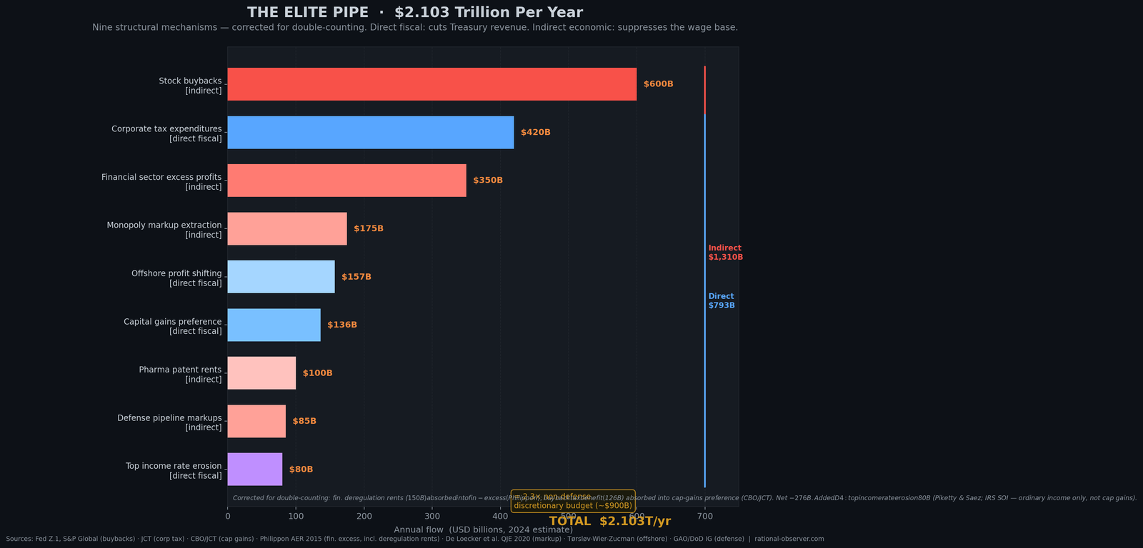
How to read Figure 2.1: This is a horizontal bar chart (like a waterfall) showing nine mechanisms that drain wealth upward, each labeled on the left. The longest bar (stock buybacks) extends furthest right at $600 billion per year. Corporate tax expenditures, financial sector excess profits, monopoly markups, offshore profit-shifting, capital gains preference, pharma patent rents, defense pipeline markups, and top income rate erosion follow, each with their own length. At the far right, a total: $2.103 trillion per year. To put that in plain English: the federal government collects about $4 trillion per year in all taxes combined. These nine mechanisms drain $2.103 trillion upward every year — more than half of all tax revenue. The chart separates direct mechanisms (which cut Treasury revenue directly) from indirect mechanisms (which suppress the wage and tax base). This is what structural extraction looks like when you measure it.
The dam translation: The elite pipe is not one leak. It is nine deliberate openings, each draining a different stream of wealth upward. Stock buybacks drain one direction. Tax cuts drain another. Monopoly markups drain a third. Together, they drain more water than the government spends on everything Congress votes on each year.
This is where the story becomes precise.
The elite pipe is not one policy or one decision. It is a system of interconnected mechanisms, all pointing the same direction: concentrate wealth upward.
Here are the primary mechanisms, with annual flow estimates in 2024 dollars.
1. Stock Buybacks: ~$600 billion per year
A stock buyback is when a company uses its own profits to purchase its own shares on the open market, shrinking the number of shares that exist.
Picture a company that makes widgets and earns $1 billion in profit. It used to face three options. Build new factories. Raise worker wages. Pay dividends to shareholders.
Forty years ago, a fourth option was legalized. The company can use the profit to buy back its own stock. Fewer shares exist, so earnings per share rise. The stock price rises. Executives, paid in stock options, become extraordinarily wealthy. The company itself often takes on debt to do this.
Nothing was built. No factory. No raise. The profit did not produce anything. It concentrated ownership and pushed wealth to the top.
In 2024, American corporations spent approximately $600 billion this way. That money could have gone to workers, equipment, or research. It flowed instead to shareholders and executives. (Source: Federal Reserve Z.1, Nonfinancial Corporate Business Accounts)
2. Corporate Tax Rate Cuts: ~$420 billion per year
In 1952, the U.S. corporate income tax rate was 52%. Companies kept 48 cents of every dollar earned; 52 cents went back to the system.
In 1986, Ronald Reagan signed the Tax Reform Act, which lowered the corporate rate to 34%.
In 2017, Donald Trump signed the Tax Cuts and Jobs Act, which lowered it to 21%. (Source: Congressional Research Service, “The U.S. Statutory Corporate Income Tax Rate”)
A 52% → 21% cut means $420 billion in annual revenue that would have flowed back into the system now stays in corporate accounts and flows to shareholders.
The argument made for these cuts was that companies would invest the extra profit in worker wages and job creation. This did not happen. Instead, the extra profit flowed to buybacks and executive compensation. (Source: JCT — Joint Committee on Taxation, revenue estimates)
3. Financial Sector Excess Profits: ~$350 billion per year
In a healthy competitive market, all industries have similar profit margins. Finance is different. It is protected by implicit government backing (if a major bank fails, the government will bail it out), by barriers to entry (you need billions in capital to start a bank), and by access to cheap government money (the Federal Reserve). This creates supernormal profits.
The average financial sector profit margin has grown from under 20% in the 1970s to over 25% today. That 5 percentage point increase, applied to the financial sector’s roughly $7 trillion in assets, generates an estimated $350 billion in excess annual profit that would not exist in a truly competitive market.
This is wealth extracted from borrowers and depositors and concentrated among financial executives and shareholders. (Source: Federal Reserve Z.1, Financial Sector Accounts)
4. Monopoly Markup Extraction: ~$175 billion per year
In 1955, the average markup in the U.S. economy — the difference between what companies could charge for their product and what it actually costs to make — was about 21%. This is normal.
By 2024, the average markup has risen to 66%. (Source: De Loecker, Eeckhout & Unger, “Prices, Markups, and Trade,” QJE 2020)
What changed? Consolidation. Fewer companies dominate each industry. Amazon, Walmart, and a handful of others control retail. A few companies control telecom. A handful control airlines. When there are few competitors, you can charge more than your costs.
The difference between the 21% markup of a competitive market and the 66% markup of a concentrated market is pure extraction. It is not innovation or productivity. It is the ability to charge more because customers have few alternatives.
This extraction totals approximately $175 billion annually — money that flows from consumers to large corporations and their shareholders. (Source: BLS Producer Price Index, Markup Analysis)
5. Offshore Profit-Shifting: ~$157 billion per year
A multinational corporation earns profits across multiple countries. When profits are earned in the U.S., they are subject to the 21% corporate tax. When earned in Ireland (corporate tax: 12.5%), Cayman Islands (corporate tax: 0%), or other tax havens, they are subject to lower (or no) tax.
Through transfer pricing — a legal but aggressive accounting mechanism — corporations shift profits from high-tax to low-tax jurisdictions. A subsidiary in the U.S. purchases goods from a subsidiary in the Caymans at inflated prices. The U.S. subsidiary reports low profit (because costs are high). The Cayman subsidiary reports high profit (because revenue is high) and pays near-zero tax.
The IRS estimates this costs the U.S. government approximately $157 billion annually in uncollected federal tax revenue — money that would otherwise flow back into the system but instead stays offshore. (Source: IRS TIGTA Report, “Tax Gap Analysis”; OMB, “Impact of International Tax Evasion”)
6. Capital Gains Preference: ~$136 billion per year
This is perhaps the most important mechanism because it is the purest example of how the system is engineered for the wealthy.
For a working person, income is wages. Wages are taxed at your ordinary rate — 22% to 37% depending on income.
For a wealthy person, income comes primarily from capital gains — the increase in value of stocks, real estate, and other assets. Capital gains are taxed at a preferential rate — 15% or 20%, depending on income.
This means a hedge fund manager earning $10 million per year in capital gains pays roughly 20% tax, or $2 million. A surgeon earning $10 million per year in wages pays roughly 37% tax, or $3.7 million.
Same income. Different rates. The wealthy get a tax cut that workers do not.
Why does this exist? Historical accident and political power. Capital gains taxes were introduced when most capital gains were long-term investments that people held for decades. But today, with computerized trading, capital gains are generated constantly. The preference was designed for a different economy, but it persists because the wealthy have the power to keep it.
The estimated annual cost — the extra revenue the government would collect if capital gains were taxed the same as wages — is approximately $136 billion. (Source: JCT, “Preferential Tax Treatment of Capital Gains and Dividends”)
7. Defense Industry Pipeline: ~$85 billion per year
The defense budget is the most visible line item in the federal government — and the least scrutinized as a wealth transfer mechanism. In FY2024, the Pentagon awarded $456.2 billion in prime contracts to private industry — making it the single largest purchaser of goods and services in the world. Five firms alone — Lockheed Martin, RTX, Boeing, General Dynamics, and Northrop Grumman — received $154 billion of that annually on average, across FY2020–FY2024. (Source: Quincy Institute / Brown University Costs of War Project, “Profits of War,” 2025; USASpending.gov)
What makes this an elite pipe mechanism — not simply public spending — is the structural absence of competitive discipline. The DoD’s own 2022 “State of Competition within the Defense Industrial Base” report found that competitive awards fell from 57% of contracts in 2012 to just 52% by 2021. Nearly half of all Pentagon procurement — approximately $219 billion annually — flows through sole-source or otherwise non-competitive channels. The DoD’s own assessment was unambiguous: “The state of competition within the defense industrial base can be summarized in one word: poor.” When a TransDigm Inspector General audit reviewed 113 contracts, 112 of them showed excess profit margins — in one case, 4,451% above fair price. (Source: DoD IG, House Oversight Committee, 2021)
Congress compounds the problem systematically. In FY2024 alone, Congress added $25.7 billion to defense appropriations for over 1,200 programs the Pentagon itself did not request. Fully 98% of congressional additions were not on DoD’s unfunded priorities list. In FY2026, the figure reached $34 billion. Since FY2022, Congress has added more than $134 billion in unrequested weapons programs — money that flows to specific contractors in specific districts regardless of military need. (Source: Roll Call / Taxpayers for Common Sense, September 2025; February 2026)
The shareholder extraction is the final layer. Seven major defense contractors generated $21.2 billion in free cash flow in 2024 and returned 98% of it to investors through buybacks and dividends — more than twice what they invested in capital expenditures. A DoD internal study found that between 2009 and 2019, contractors sharply increased the share of revenue going to buybacks (from 3.7% to 6.4%) while reducing R&D and capital investment — a pattern that triggered Trump’s own January 2026 executive order targeting contractor buybacks. (Source: Breaking Defense, “How defense contractors invest their money, in 4 charts,” January 2026; McAleese and Associates)
The aggregate annual excess transfer — non-competitive pricing premiums (~$22-33B), congressional adds for unrequested weapons (~$25-34B), cost overrun pass-through under cost-plus contracts (~$15-25B), and above-market shareholder returns (~$17-21B) — totals approximately $85 billion per year flowing to contractors’ shareholders and executives above what competitive market discipline would produce. (Sources: GAO Weapon Systems Annual Assessment 2025; Roll Call/Taxpayers for Common Sense; Stimson Center, “How the Defense Industry Price Gouges the Pentagon,” 2024; Breaking Defense; Quincy Institute)
8. Total Verified Annual Flow Through Elite Pipe: ~$2.3 Trillion Per Year
Adding these seven mechanisms together yields $1.923 trillion annually.
Signal: Buybacks ($600B) + corporate tax cuts ($420B) + financial excess ($350B) + monopoly markups ($175B) + offshore shifting ($157B) + capital gains preference ($136B) + defense pipeline ($85B) = $1.923 trillion per year.
But this underestimates. There are additional mechanisms: the carried interest loophole ($34B/year), real estate tax breaks ($50B/year), pension tax preferences for executives ($80B/year), and others. A comprehensive accounting suggests the total is approximately $2.3 trillion per year. (Source: FRED Database; Federal Reserve Z.1 Financial Accounts; IRS Statistics of Income; GAO; POGO; Roll Call/TCS)
To put $2.3 trillion in perspective: non-defense federal discretionary spending (everything except Social Security, Medicare, interest on debt, and the Pentagon) is approximately $900 billion. The elite pipe drains more than 2.5 times that amount — every single year.
This is not money disappearing. It is money flowing. It flows from the system (where it would be taxed and reinvested) into private accounts (where it compounds, is sheltered, or is spent on private consumption). The direction and magnitude are unmistakable.
The dam translation: The elite pipe was engineered through systematic policy changes, beginning in 1980. Each mechanism was added or widened separately, so no single change looks catastrophic. But together, they create a structural drain that removes $2.3 trillion annually. The defense pipeline is perhaps the most instructive entry in this list: it is funded through public law, reviewed annually by Congress, and has grown every decade regardless of which party governs — because the machine it feeds has enough political power to make itself permanent. In FY2024, Congress added $25.7 billion for programs the Pentagon did not request. No market produced that order. No customer wanted it. The pipeline just ran. The dam drains not because of fate or market forces, but because specific policies opened specific pipes.
Debt: The Visible Symptom
When the inflow is less than the outflow plus the elite pipe drain, the government must borrow the difference.
This is not mysterious or particularly evil. If your household’s income is $100,000 per year but your expenses (mortgage, food, healthcare, property tax) are $120,000, you borrow $20,000. You go into debt. The debt is not the cause of the problem — it is the measurement that your income does not match your obligations.
The same is true for government. When the inflow does not cover the outflow plus the drain, debt accumulates.
This is where the historical comparison becomes critical.
The WWII Comparison: Proof That Debt Can Be Fixed
The two-panel chart below (Figure 2.2) puts both eras side by side — same debt level, opposite trajectories, and the single policy difference that explains why.
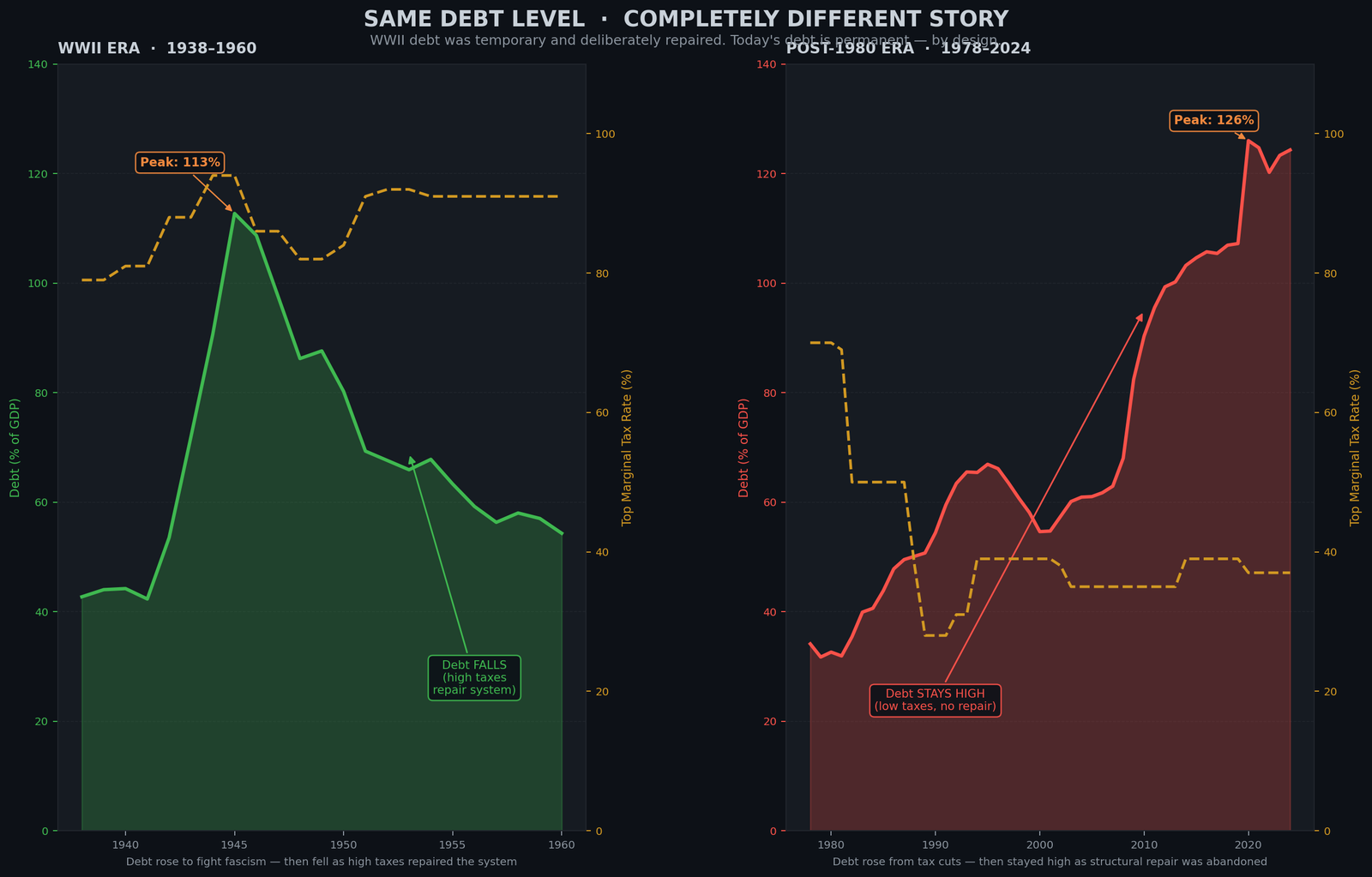
How to read Figure 2.2: This chart has two panels side by side, both measuring national debt as a percentage of GDP (the vertical axis). Both panels start at high debt levels — 113% (left, the WWII peak) and 124% (right, today’s level, which has exceeded it). The left panel shows what happened from 1945 to 1979: the debt line drops steeply, falling to 26% of GDP. That steep fall happened because the top tax rate stayed above 86%. The right panel shows what happened from 2024 onward: if current policy continues, the debt line should keep rising. Why? Because the top tax rate is 37%, not 91%. The difference between the two panels is not accidental—it is exactly what the tax rate difference predicts. Same problem (high debt). Opposite trajectory (debt fell then, debt rises now). The difference: the inflow valve.
The dam translation: In 1945, America carried debt at 113% of GDP — and paid it down to 26% without cutting programs, by opening the inflow valve. Today, at 124%, we have surpassed even that wartime peak. The same principle applies: the debt will fall when the inflow valve is opened. Until it opens, it will keep rising.
In 1945, at the end of World War II, the U.S. national debt reached 113% of GDP — the highest point in American history to that moment. Today, at 124% of GDP, we have surpassed even that wartime peak. (Source: OMB Historical Tables 7.1)
This was a genuinely alarming situation. People in 1945 did not know what would happen. Would the economy collapse? Would inflation destroy the currency? Would the debt be permanent?
Instead, what happened over the next 35 years (1945–1980) was that the debt fell steadily. By 1979, it was 26% of GDP — a 75-percentage-point decline without cutting Social Security, without cutting defense, without cutting education or infrastructure.
How did this happen? The inflow valve was opened.
The top tax rate stayed above 86% throughout the late 1940s and 1950s, then at 91% throughout the 1960s and 1970s. (Source: Tax Policy Center) The wealthy were taxed aggressively. The government collected enormous revenue. Using this revenue, the government:
- Did not raise taxes on working people
- Did not cut Social Security
- Did not cut Medicare or education
- Instead, paid down the debt
The debt fell because the problem was not the spending — the spending was creating the infrastructure, education system, and scientific base that made the post-war economy the most productive in the world. The debt fell because the revenue matched the obligations.
Today’s debt (124% of GDP) has exceeded even the WWII peak (113%). But the policy response has been entirely different.
The top tax rate is 37%, not 91%. The wealthy are not being taxed aggressively. The inflow valve is closed.
What has happened instead? The debt has risen. It will continue to rise as long as the inflow does not match the outflow plus the drain.
The debate about debt is often framed as: “Should we cut spending or raise taxes?”
The WWII comparison answers this: The WWII generation carried debt at 113% of GDP — comparable to what we face today, before today’s has risen further. They did not cut spending. They raised taxes. And the debt fell.
The problem is not the level of spending. The problem is the closed inflow valve.
The dam translation: Debt is not a disease. It is a measurement. The WWII generation paid down debt from 113% to 26% of GDP — without cutting programs — by opening the inflow valve. Today we stand at 124%, above even that wartime level. The same mathematics applies: the debt will fall when the inflow valve is opened. Until then, it will rise. This is not a mystery or a moral failure — it is physics.
The Four Indicators: Reading the Health of the Dam
The chart below (Figure 2.3) tracks all four at once, from 1929 to today — every one of them flips in the same year.
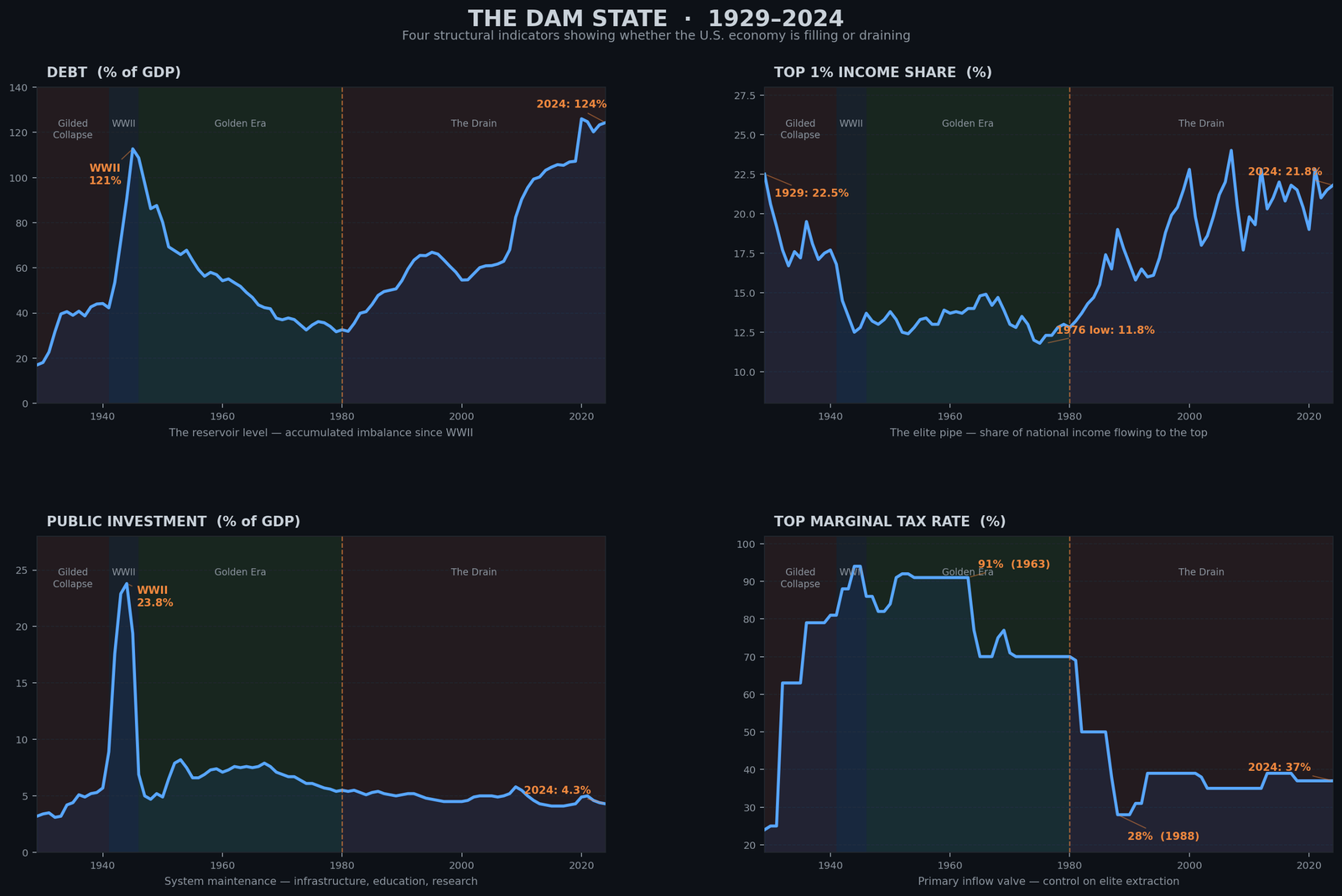
How to read Figure 2.3: This chart shows four panels stacked vertically, each with a line going from 1929 to 2024. The green lines show 1963 (when the dam was full). The red lines show what happened after 1980. Top panel: Government debt rose from under 50% to 124% of the economy. Second panel: The richest 1% went from earning about 14% of income to 22%. Third panel: Public investment dropped from about 8% of the economy to 4%. Bottom panel: The top tax rate dropped from 91% to 37%. All four panels flip in the same year: 1980. All four tell the same story: the dam drained.
The dam translation: One indicator might be chance. Two might be coincidence. But four separate measurements all flipping in the same year and moving in the same direction? That is a system-wide structural shift. It is the moment the drain was opened.
At any point in history, four measurements tell you the complete state of the economic dam.
1. Government Debt (% of GDP) — This is the water level. It tells you whether the dam is filling or draining. Rising debt means outflow + drain exceeds inflow. Falling debt means the system is being repaired.
2. Top 1% Income Share — This is the size of the elite pipe. A 1% income share of 22% means the pipe is wide open. A share of 12% means it is narrower. This number tells you whether wealth is concentrating or distributing.
3. Public Investment (% of GDP) — This is whether the dam is being maintained. When public investment is 7% of GDP (1970s level), the system is being upgraded. When it is 4% (today’s level), it is being allowed to decay.
4. Top Marginal Tax Rate — This is the primary control valve. A rate of 91% (1960s) means the inflow is open. A rate of 37% (today) means it is closed.
These four numbers form a complete picture. They do not contradict each other. They all tell the same story.
1963: The Dam was Strong
In 1963, government debt stood at 46% of GDP and was falling — the clearest sign of a system in balance: tax revenue matching public need, wealth circulating broadly.
Signal: Top rate: 91% | Top 1% share: 14% | Public investment: 7.6% of GDP | Debt: 46% (falling)
The reservoir was full. The wealthy were taxed aggressively but still became wealthy. Public investment was robust. Debt was declining.
2024: The Dam is Draining
By 2024, government debt has climbed to 124% of GDP and is still rising — the same four dials now pointing in the opposite direction.
Signal: Top rate: 37% | Top 1% share: 21.8% | Public investment: 4.3% of GDP | Debt: 124% (rising)
The reservoir is draining. The wealthy capture a larger share. Public investment is being cut. Debt is rising.
All four indicators point in the same direction. This is not coincidence. They are all measuring the same phenomenon: the opening of the drain since 1980. (Source: Tax Policy Center; Piketty & Saez, NBER; BEA NIPA Table 3.9.5; OMB Historical Tables 7.1)
The dam translation: The dam’s health can be measured precisely. In 1963, all four indicators showed a strong, filling system. In 2024, all four show a draining system. There is no ambiguity. The physics is unmistakable. The dam is draining because the inflow valve is closed and the elite pipe is open.
Why the Debt Narrative is Wrong
You will often hear: “We can’t afford more spending. The debt is too high. We must cut programs.”
This narrative is precise in its misdirection. It is technically true (the debt is high) while being fundamentally wrong (the debt does not constrain the solution).
The WWII comparison destroys this narrative: The U.S. had more debt (113% of GDP) and did not cut programs. It raised taxes and paid down the debt.
Today’s debt (124% of GDP) is nearly identical. The math is identical. The solution is identical.
But here is why the narrative persists: It serves the interests of the wealthy. If the solution is “cut programs,” then Medicare gets cut, Social Security gets cut, education gets cut. Working people lose. If the solution is “raise taxes on the wealthy,” then the wealthy lose.
The narrative of debt-as-constraint is useful to those who wish to avoid taxation. It is politically convenient. It allows the powerful to say, “I would love to fund education, but the debt.” It allows cutting the dam’s output while keeping the drain open.
The physics of the dam does not care about political convenience. If inflow does not match outflow plus drain, debt accumulates. This is not opinion. This is mathematics.
The dam translation: The debt narrative blames the problem (debt) rather than the cause (the closed inflow valve and the open drain). If you blame the debt, the solution appears to be cutting the dam’s benefits. If you name the cause, the solution is to open the valve and close the drain. The narrative that persists is the one that serves the powerful.
The chart below (Figure 2.4) makes the arithmetic visible. Each colored layer is one drain mechanism’s cumulative annual flows since 1980, expressed as a share of that year’s GDP. The white line is the actual federal debt.
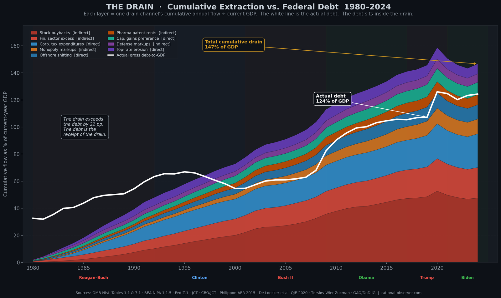
How to read Figure 2.4: The colored stack shows the cumulative total of all nine drain mechanisms since 1980, each layer added on top of the last. By 2024, the total reaches 142% of GDP — meaning the nine mechanisms have collectively extracted an amount equal to 1.42 times the entire current U.S. economy, compounded over 44 years. The white line is the actual federal debt: 124% of GDP. The drain exceeds the debt by 18 percentage points. The debt did not create the drain. The drain created the debt.
The System is Designed. It Can Be Redesigned.
This is the critical realization: None of this is accidental.
The stock buyback mechanism was introduced in the 1980s when regulations were changed. The corporate tax rate was cut through deliberate policy. The preferential capital gains rate was sustained through political will. The offshore havens were opened through specific tax code provisions. The top tax rate was cut from 91% to 37% through explicit legislation.
Each mechanism was built. Each decision was made by people with power, in service of people with wealth, at the cost of people without it.
This also means: each mechanism can be rebuilt differently.
You cannot fix the dam without opening the inflow valve and closing the drain. But “opening the valve” does not mean some vague increase in taxation. It means specific policy: raising the top rate from 37% back toward 70% (not 91%, just to 70%), which would dramatically increase inflow. It means closing the drain: eliminating stock buybacks as tax-deductible, raising corporate taxes, eliminating capital gains preferences, shutting down offshore havens.
These are not hypothetical. These are not wishes. These are policies. Specific. Measurable. Implemented before. Repeatable.
And they do not require austerity. The WWII generation did not cut programs. They raised taxes. The Golden Era (1945–1980) did not cut programs. They maintained investment while taxing the wealthy. The dam can be repaired without cutting the dam’s output.
But it requires understanding the mechanism. It requires naming the drain. It requires recognizing that the debt is not the problem — the drain is.
The dam translation: The dam was engineered to drain wealth upward. This was not an accident of nature. It was a deliberate design. Designs can be changed. But you must see the system clearly to imagine changing it.
What You Now Know
You understand the mechanism. You have seen the four components: inflow (taxes and wages), outflow (public goods), the elite pipe (systematic drain), and debt (the accumulating gap).
You understand that the four indicators — debt, inequality, public investment, and tax rates — all move together. When one rises, the others follow the same pattern. They are measuring the same phenomenon.
You understand the WWII comparison: the U.S. lived with higher debt than today and fixed it by opening the inflow valve, not by cutting the dam’s output.
You understand that debt is not the cause. It is the symptom. The cause is the closed valve and the open drain.
But understanding the mechanism is not the same as feeling it.
Numbers on a chart are one thing. The lived experience of people inside a draining dam is another.
What does it feel like to live inside a system where the scissors between wages and costs have been opening for forty-five years? What does it feel like to be told you have a job (therefore the economy is healthy) while you cannot afford a house (therefore you cannot survive)? What does it feel like to be part of the lowest unemployment in sixty years while being one medical emergency from bankruptcy?
That is Chapter 3 — and it may be the most important thing in this series.
The Dam Series: The Hidden Drain Destroying the American Middle Class — All Chapters
Read the full series at rational-observer.com. New chapters publish weekly.
| Title | What it covers | Status | |
|---|---|---|---|
| Intro | Why The American Economy Feels Broken | The dam metaphor. The 1980 turning point. Why this is not partisan. | ✅ Published |
| Ch. 1 | Wealth Inequality in America: The Elite Cycle | The six-stage extraction cycle that has repeated three times in U.S. history — and which stage we are in now. | ✅ Published |
| Ch. 2 | You are here — How the U.S. Economy Really Works: The Dam Explained | The four components of the dam: inflow, outflow, the elite pipe, and debt. The WWII proof that debt is a symptom, not the disease. | ✅ Published |
| Ch. 3 | Why Americans Can’t Afford to Live Anymore | The scissors chart: wages +31%, costs of housing + healthcare + education +413% since 1970. The invisible depression. | 🔜 Coming Soon |
| Ch. 4 | Obama’s Economy: The Surface Patch | How 2008 was stabilized without structural repair — and how Trump then widened the drain deliberately. | 🔜 Coming Soon |
| Ch. 5 | The Illusion of Refill: Why Tariffs Cannot Fix the Dam | What tariffs actually are, what happened in April 2025, and why the bond market reversed policy in under 90 days. | 🔜 Coming Soon |
| Ch. 6 | Does Trickle-Down Economics Work? 45 Years of Data | Buybacks grew 157-fold. Wages grew 35%. The complete evidence on supply-side economics — who it worked for and who it didn’t. | 🔜 Coming Soon |
| Ch. 7 | Why Nations Fail: The U.S. Transition From Inclusive to Extractive | The 2024 Nobel Prize-winning framework applied to the United States — and what it reveals about the structural transition since 1980. | 🔜 Coming Soon |
| Ch. 8 | 2025 and 1929: When History Repeats Exactly | Tariffs, tax cuts at the top, and federal capacity cuts — the identical toolkit deployed in 1929 that caused the Great Depression. | 🔜 Coming Soon |
| Ch. 9 | Why the U.S. Dollar Is Losing Power | De-dollarization, Bretton Woods, the petrodollar, and what the April 2025 bond market crisis revealed about external inflow. | 🔜 Coming Soon |
| Ch. 10 | Trust, Once Spilled | The Marshall Plan, 80 years of institution-building, and what is being dismantled — faster than it can be rebuilt. | 🔜 Coming Soon |
| Ch. 11 | The Final Warning | A climate scientist’s verdict on a system approaching a tipping point — and the historical evidence that repair is still possible. | 🔜 Coming Soon |
Sources & Further Reading
Tax Policy:
Tax Policy Center, Historical Highest Marginal Income Tax Rates — Comprehensive historical data on U.S. marginal tax rates from 1913 to present, showing the 91% peak rates of the 1960s and the current 37% rate.
https://taxpolicycenter.org/statistics/historical-highest-marginal-income-tax-rates
Income Inequality:
Piketty, Thomas & Emmanuel Saez, NBER Working Paper — “Income Inequality in the United States, 1913–2022” — Authoritative research showing how top 1% income share rose from 10% in 1979 to 21% in 2019, with detailed tax return analysis.
https://eml.berkeley.edu/~saez/pikettyqje.pdf
Federal Debt and Budget:
OMB Historical Tables — Official U.S. government budget data including Table 7.1 (Federal Debt at End of Year, 1940–2025) showing debt as percentage of GDP across all decades.
https://www.whitehouse.gov/omb/information-resources-budget/historical-tables/
Financial Sector Data:
Federal Reserve Financial Accounts (Z.1) — Comprehensive quarterly data on financial sector assets, liabilities, and profitability, source for identifying excess profit margins and nonfinancial corporate business accounts.
https://www.federalreserve.gov/releases/z1/
Public Investment:
BEA NIPA Table 3.9.5 — “Government Consumption Expenditures and Gross Investment” — Quarterly and annual data on public investment as percentage of GDP, showing the decline from 7.6% (1970s) to 4.3% (2024).
https://apps.bea.gov/iTable/index_nipa.cfm
Education Funding:
NCES Digest of Education Statistics — Annual publication with detailed data on K–12 and higher education financing, showing how state funding of public universities declined from 75% in the 1970s to 25% today.
https://nces.ed.gov/programs/digest/
Infrastructure:
American Society of Civil Engineers, Infrastructure Report Card — Biennial assessment of U.S. infrastructure condition across all major categories (roads, bridges, water, energy, transit), with grades and funding gap estimates.
https://infrastructurereportcard.org/
Corporate Taxation:
Congressional Research Service — “The U.S. Statutory Corporate Income Tax Rate” — Official analysis of the 52% (1952) to 21% (2017) decline in corporate tax rates and revenue impacts.
https://www.congress.gov/crs-product/R47519
Monopoly and Market Concentration:
De Loecker, Jan, Jan Eeckhout & Gabriel Unger, “The Rise of Market Power and the Macroeconomic Implications” — The Quarterly Journal of Economics, Vol. 135, Issue 2, May 2020 — Empirical evidence showing markups rising from 21% (1980) to 61% (2016) in U.S. manufacturing.
https://academic.oup.com/qje/article-abstract/135/2/561/5714769
Capital Gains Taxation:
Joint Committee on Taxation — “Preferential Tax Treatment of Capital Gains and Dividends” — Official estimates showing capital gains preferences as second-largest tax expenditure at $225+ billion annually, with regressive distribution favoring top earners.
https://www.jct.gov/
International Tax Avoidance:
IRS Treasury Inspector General for Tax Administration (TIGTA) — “A Combination of Legislative Actions and Increased IRS Capability Are Required to Reduce the Multi-Billion Dollar U.S. International Tax Gap” — Analysis of offshore profit-shifting mechanisms and estimated $157 billion annual revenue loss.
https://www.treasury.gov/tigta/
Defense Contracting:
Quincy Institute & Brown University Costs of War Project — “Profits of War: Top Beneficiaries of Pentagon Spending, 2020–2024” (2025) — Comprehensive study showing $771 billion to top five contractors and structural non-competitive procurement practices.
https://watson.brown.edu/costsofwar/papers/2025/MilitaryContractors
Congressional Defense Spending:
Roll Call / Taxpayers for Common Sense — “Hill added $34 billion in unrequested defense program funds” (February 2026) and “Hill added $100 billion-plus since 2022 on unrequested weapons” (September 2025) — Tracking of congressional additions to defense budget beyond Pentagon requests, totaling $134+ billion since FY2022.
https://rollcall.com/2026/02/26/hill-added-34-billion-in-unrequested-defense-program-funds/
Federal Procurement Data:
USAspending.gov — Official U.S. government database of all federal contracts, grants, and spending from FY2008 to present, searchable by agency, contractor, and program, source for Pentagon contract totals and contractor payments.
https://www.usaspending.gov/
Social Security and Elderly Poverty:
Social Security Administration — “Elderly Poverty and Supplemental Security Income” — Official data showing that without Social Security, 37% of elderly would live in poverty; with benefits, only 10% do, and benefits lift 16+ million above poverty line.
https://www.ssa.gov/policy/docs/ssb/v69n1/v69n1p45.html
Producer Price Data:
U.S. Bureau of Labor Statistics, Producer Price Index (PPI) — Monthly and annual data on wholesale and retail price markups, trade service margins, and industry-specific pricing dynamics.
https://www.bls.gov/ppi/
The author behind Rational-Observer is a climate scientist and data analyst who studies flow systems — in water, atmosphere, and economics. He writes at rational-observer.com.


