 By admin
 The Dam Series — Chapter 3 of 11
Chapter 2 showed the blueprint of the dam: inflow, outflow, the elite pipe draining wealth upward, and debt filling the gap. The structure is clear. The data is unambiguous. But numbers on a chart don’t bleed.
This chapter is the emotional center of the series. It is the chapter you will want to forward to someone who says “stop complaining — get a better job.” It maps the lived experience of the draining dam: housing you cannot afford on two incomes, healthcare that can bankrupt a working family, a college degree that now comes with a debt that takes a decade to repay. This is not personal failure. This is what the dam looks like from the inside.
The Dam Series — Chapter 3: Why Americans Can’t Afford to Live Anymore
Key Takeaways
- The U.S. is experiencing an invisible depression — not a sudden collapse, but a 45-year deterioration that is difficult to see because there is no single catastrophic moment.
- 60% of Americans cannot cover a $1,000 emergency without debt, while the unemployment rate is 3–5%. Low unemployment does not equal financial security.
- Since 1970, real median wages have risen 31% but the cost of housing, healthcare, and education combined have risen 413%. The scissors between what work pays and what life costs have been opening steadily.
- Housing: a median home in 1970 cost 3× the median annual income; in 2024 it costs 8–10×. Homeownership for under-35s is at its lowest recorded level.
- Healthcare: the U.S. spends $14,775 per person per year (highest in the world) while having lower life expectancy than other wealthy nations. 38% of Americans skip medical care because they cannot afford it.
- College: tuition has risen 600% in real terms since 1970. A student working minimum wage could pay for a semester in 1970; today it takes an entire year of full-time work.
- This is not personal failure or bad luck. It is what happens when the dam drains for 45 years — the cost of a normal life exceeds what normal work pays.
She could not afford to go to the doctor.
She was working. Full-time. She had insurance. But the deductible was $3,500, and her bank account had $340. So when she felt the chest pain, she did what millions of Americans do: she did not go.
Three days later, the pain was worse. She went to an urgent care clinic instead of the emergency room. They told her to go to the ER. She could not afford it. She went home and waited.
This is not a symptom of poverty. She made $50,000 per year. By historical American standards, she was middle class. She had a job. She had health insurance.
And she was too poor to see a doctor.
This is what the invisible depression feels like. Not the sudden crash of 1929, where the collapse is instantaneous and visible. Instead, a slow deterioration so gradual that each year is individually survivable, but thirty years of years means the math no longer works.
Low unemployment. Job growth. Markets at record highs. And sixty percent of Americans unable to cover a $1,000 emergency. This is not a contradiction. This is a specific kind of catastrophe: one that is invisible because it has no sudden moment, only the steady accumulation of years in which you earn a normal income and cannot afford a normal life.
The Great Depression vs. The Slow Depression: Two Different Crashes, Same Outcome
The Great Depression happened in visible time. It had a date: October 1929. Within three years, unemployment was 25%. Breadlines stretched around city blocks. Banks failed. Families lost everything.
You could photograph it. You could measure it. You could point to a moment and say: before this point, the system worked. After this point, it did not.
The Slow Depression has no such moment. It began in 1980. It is still happening. Each year has been individually survivable. The scissors between what work pays and what life costs have been opening so gradually that most people experience it not as a depression, but as personal failure. “I should have planned better. I should have worked harder. I should have made better choices.”
But it is not personal failure. It is mathematics.
Here is the comparison:
| Factor | Great Depression (1929–1936) | The Slow Depression (1980–2024) |
|---|---|---|
| Unemployment | 25% — people could not find work | 3–5% — people work constantly, often multiple jobs |
| The Mechanism | Demand collapsed; businesses failed; credit dried up | Costs outran wages; people borrowed to survive; credit expanded to fill the gap |
| Debt Crisis | Corporate and bank debt imploded; wiped out savings | Household debt compounds endlessly; future income already spent |
| Prices | Deflation — but income fell faster; still unaffordable | Inflation in necessities; wages stagnant; affordability crashes |
| Wealth Concentration | Top 1% earned 22.5% of income (1929) | Top 1% earns 21.8% of income (2024) — almost exactly the pre-crash level |
| Visibility | Catastrophic and obvious in 3 years | Invisible deterioration over 45 years |
| The Common Outcome | Median American cannot afford a normal life | Median American cannot afford a normal life |
This comparison is not hyperbole. It is structural. In both cases, the system reached a state where normal work does not pay for a normal life. The difference is only in the timeline and visibility.
In 1929, the top 1% captured 22.5% of national income. The system broke. Unemployment exploded.
In 2024, the top 1% captures 21.8% of national income. The system has not visibly broken — unemployment is low, stock markets are high — but the underlying condition is the same. The dam is draining at the same structural rate it was in 1929.
We are living exactly at the breaking point. But because we are 45 years into a gradual collapse rather than 3 years into a sudden one, the breaking point feels normal. (Source: Piketty & Saez, NBER 2024 update)
The dam translation: The Great Depression broke suddenly. The Slow Depression breaks slowly. Both break because wealth is being drained faster than the system can sustain. The difference is only in how long the breaking takes and how invisible it is while it happens.
The Scissors Chart: The Visual Truth of the Slow Depression
The chart below (Figure 3.1) makes the slow depression visible in a single image — two lines that moved together for decades, then split apart and never came back.
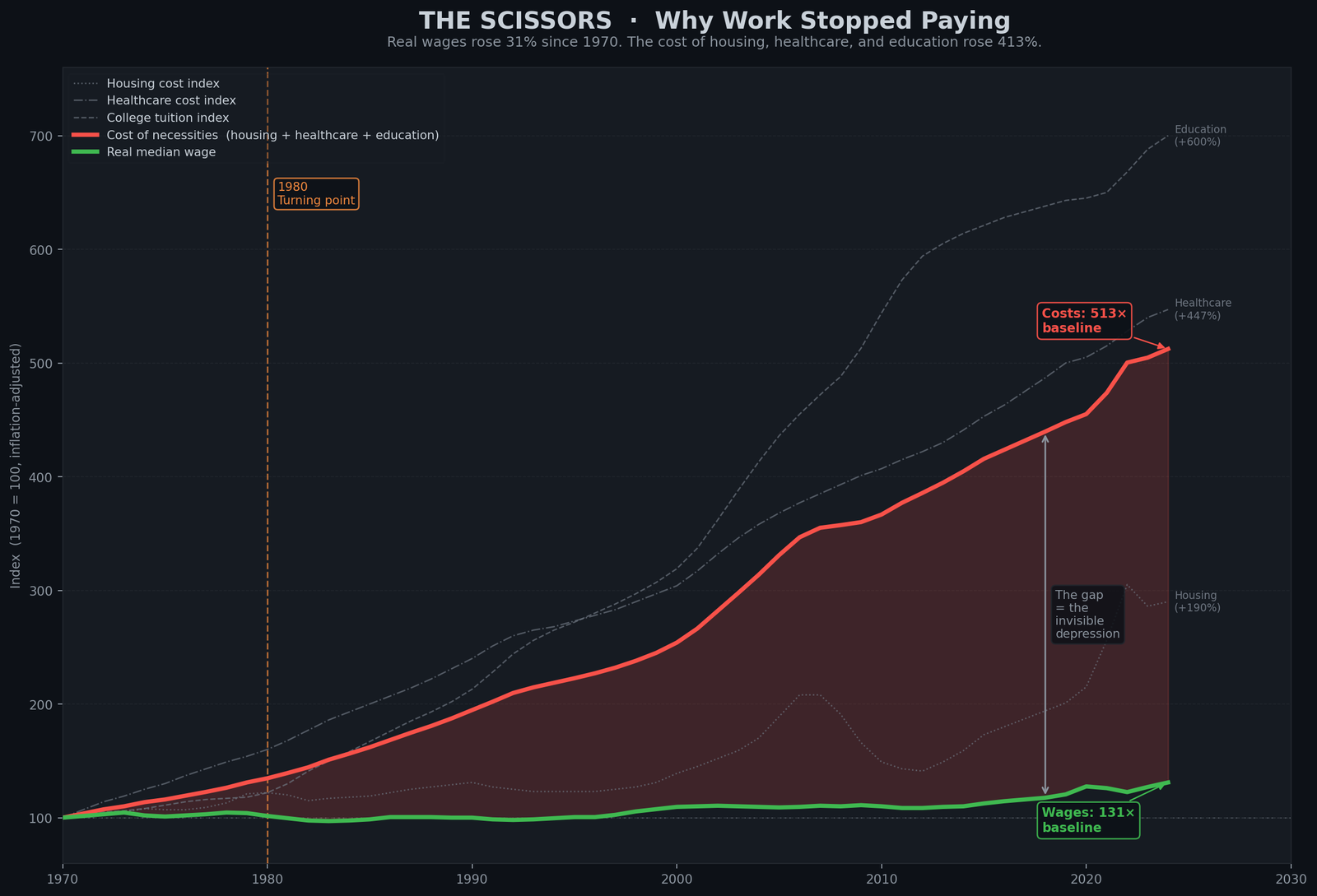
How to read Figure 3.1: Two lines start together in 1970 (both at 100). One line (green) represents real wages—what the average American earns, adjusted for inflation. The other line (red) represents the combined cost of housing, healthcare, and college education, also adjusted for inflation. For the first decade (1970–1980), the lines move together, staying close. This is what a functioning economy looks like—earnings and costs in balance. But starting in 1980, they separate. The green line goes up slowly (by 2024 it reaches about 131). The red line shoots upward steeply (by 2024 it reaches about 513—more than five times higher). The gap between them widens year by year. That gap is where people are being crushed. It is not that wages fell. It is that costs rose five times faster than wages. You can work full-time and still not afford a house, healthcare, or college. That is what the scissors chart shows.
The dam translation: Before 1980, the dam distributed water fairly. Wages and costs stayed in balance. After 1980, the valve opened on top and closed on the bottom. Costs rose for the things ordinary people need (housing, healthcare, education). Wages stagnated. The scissors opened. The gap is where middle-class stability disappeared.
If you plot two lines on a single chart, both indexed to 1970 = 100 and both adjusted for inflation, something becomes clear.
One line: Real median wage (what work pays) — indexed to 1970 = 100, reaching 131 by 2024, a gain of 31% over 54 years.
The other line: Composite cost of necessities (housing + healthcare + education) — same index, same start, reaching 513 by 2024, a rise of 413%.
Signal: Wages: 1970 → 100, 2024 → 131 (+31%). Cost of living: 1970 → 100, 2024 → 513 (+413%). The gap between them is the invisible depression.
The first line moves up slowly. The second line shoots upward. The space between them — the dark red space on the chart — is where people are being crushed.
What work pays (green line) has gone up slightly. What life costs (red line) has gone up dramatically. The gap between them is the invisible depression. It opened in 1980 and has never closed.
But the chart shows something else. There is a before. From 1946 to 1979, the two lines move together. They stay close. The scissors are closed. That world was not luck. It was specific policy choices: strong public funding for education, taxation on the wealthy high enough to fund infrastructure and research, healthcare that was not yet fully privatized, unions strong enough to ensure wages tracked productivity.
The scissors can close. But not by working harder. Not by blaming immigrants or China. Only by closing the drain and opening the inflow valve.
Housing: From Achievable to Impossible
In 1970, if you wanted to buy a home, here is what the math looked like:
- Median home price: approximately $30,000 (in nominal dollars)
- Median household income: approximately $9,000
- Ratio: 3.3 to 1
For a couple both working, this was achievable. Save for a few years, pool resources, take out a mortgage. Millions did it. By the early 1970s, homeownership had reached 65% of the population — the highest rate ever recorded. (Source: U.S. Census Bureau, Historical Homeownership Rates)
For a 30-year-old in 1970, homeownership was a realistic goal of a normal working life.
In 2024, the math is different:
- Median home price: approximately $430,000 (in nominal dollars)
- Median household income: approximately $75,000
- Ratio: 5.7 to 1
But this understates the problem because inflation is higher, so nominal income looks closer to reality than real purchasing power suggests. In real (inflation-adjusted) dollars, the ratio is closer to 8–10:1 in expensive areas and 5–6:1 in cheaper areas.
What does this mean in practical terms? In most U.S. metropolitan areas, a couple both working full-time at median wages cannot qualify for a mortgage on a median-priced home. Lenders typically require that housing costs (mortgage, taxes, insurance) not exceed 28% of gross income. For a couple earning $150,000 combined, that is $42,000 per year, or $3,500 per month. A median-priced home in most major cities requires a $400,000–$500,000 mortgage, which creates monthly payments (principal, interest, taxes, insurance) of $4,500–$6,000.
The math does not work. (Source: National Association of Realtors; U.S. Census Bureau, Median Home Prices vs. Income)
This is the most direct measurement of the invisible depression: the asset that historically built the American middle class — home equity, intergenerational wealth, stability — has been repriced out of reach for the generation that needs it most.
Homeownership under age 35 reached 38.6% in 2023, the lowest rate ever recorded. (Source: U.S. Census Bureau, Age-Related Homeownership Trends) A generation is now growing up with no realistic path to home ownership.
Every delay in homeownership is a delay in building equity. Every year renting instead of owning is a year that payment goes to a landlord instead of building personal wealth. By age 40, someone who rented for 15 years has accumulated zero equity. Someone who owned has accumulated hundreds of thousands of dollars.
This is how wealth is transmitted (or not transmitted) across generations. The scissors between housing cost and wages have become the most visible mechanism of inherited inequality.
The dam translation: The dam built the asset that funded the American middle class: homeownership. Today, the dam is draining that asset out of reach. A generation is growing up seeing homeownership as impossible, not as a realistic goal. The mechanism of wealth transmission is being severed.
Healthcare: The Most Expensive System in the World, With Worse Outcomes
The United States spends more per capita on healthcare than any other nation on earth: $14,775 per person per year. (Source: CMS National Health Expenditure Accounts 2024)
The second most expensive country is Switzerland at roughly $10,000 per person per year. Switzerland spends 33% less per capita than the United States — and its citizens live to 84.2, compared to the U.S. average of 78.4.
Signal: Life expectancy — U.S.: 78.4 | Switzerland: 84.2 | Japan: 83.6 | France: 82.7 | Germany: 82.7. The U.S. ranks last among wealthy nations despite spending the most.
The United States spends dramatically more per capita and gets worse health outcomes than other wealthy nations. This is not speculation. This is international data. The U.S. spends the most and ranks last among wealthy nations. (Source: OECD Health Statistics 2024)
Why? Because the U.S. healthcare system is designed for extraction, not health.
The average family health insurance premium (employer-provided) is approximately $25,000 per year. The employer pays about $18,500; the employee pays about $6,500 out of pocket, before any care is received. (Source: KFF Employer Health Benefits Survey 2024)
This is the inflow to the insurance system. What is the outflow to actual healthcare delivery? A single ER visit costs $1,200–$2,500 out of pocket after insurance — enough to shatter a family’s monthly budget before anything else goes wrong.
Signal: Doctor visit: $200–$300 | ER: $1,200–$2,500 | Hospital stay: $2,000–$8,000 | MRI: $500–$1,500 | Prescription: $50–$200/month per drug.
These are the numbers people actually pay when they actually get sick.
The insurance premium ($6,500/year out of pocket) is supposed to cover this. But the deductible for a typical plan is $1,500–$3,000. So the first $1,500–$3,000 of actual care is paid entirely out of pocket. Only after the deductible is met does insurance start to pay.
For someone earning $50,000 per year, the insurance premium alone ($6,500) plus a standard $2,000 deductible leaves just $41,500 — $3,458 per month — for rent, food, and everything else before a single medical bill arrives.
Signal: $50,000 income → $6,500 premium (employee share) → $2,000 deductible → $41,500 remaining for all other living costs.
One medical emergency — one ER visit, one diagnosis, one surgery — and the deductible is met. Then co-insurance kicks in, where the patient pays 20–40% of costs. For someone with chronic disease or serious illness, costs quickly exceed thousands per month.
This is why medical debt is the leading cause of bankruptcy in the United States. (Source: American Journal of Public Health, “Medical Bankruptcy in the United States”)
And this is why 38% of Americans reported in a 2024 survey that they skipped or delayed medical care because they could not afford it. (Source: KFF Survey on Healthcare 2024)
This means millions of Americans are making the calculation: Is the cost of going to the doctor worth the financial risk? And deciding: no. Better to hope it goes away.
This is not the cost of healthcare. This is the cost of the system designed to extract wealth from sick people.
A person working full-time, with insurance, unable to afford to see a doctor when she is sick. This is what the invisible depression looks like at the point where the dam’s structural drain directly touches a person’s body.
The dam translation: Healthcare in other wealthy countries is a system to maintain health. In the U.S., it is a system to extract wealth from the sick. The result is: we spend the most and have the worst outcomes. A working person with insurance cannot afford to be sick. The dam is draining health to concentrate wealth.
College: The Credential That Became a Debt Instrument
The credential required to access the middle class has been transformed into a mechanism of debt enslavement.
In 1970–71, the average tuition at a public university was $394 per year (nominal dollars). (Source: NCES Digest of Education Statistics)
A student working minimum wage over the summer at full-time hours (8 weeks × 40 hours = 320 hours) could earn approximately $480 (at the 1970 minimum wage of $1.50/hour). This was enough to pay for a full year of tuition.
A student could work part-time during school and a full-time job in summer and pay for tuition out of current income. No debt. No multi-generational burden.
In 2024–25, the average tuition at a public university is $10,340 per year (nominal dollars). (Source: NCES/College Board, 2024)
A student working minimum wage over the summer (8 weeks × 40 hours = 320 hours) would earn approximately $2,320 (at the 2024 federal minimum wage of $7.25/hour). This covers roughly 22% of tuition.
To pay for one semester (half a year) of tuition, a student working full-time at minimum wage needs one full calendar year.
In real (inflation-adjusted) terms, tuition has increased 600% since 1970. (Source: College Board, “Trends in College Pricing,” 2024 edition)
The result: Total U.S. student debt is $1.833 trillion as of 2026. (Source: Federal Reserve, 2026)
This debt is not incurred because students are irresponsible. It is incurred because the cost of the credential required to access the middle class has been disconnected from what normal work pays.
A person graduates at age 22 with $40,000 in debt. The average entry-level salary for a college graduate is $55,000. The debt repayment, combined with taxes, rent, and food, leaves no room for anything else. Marriage, home purchase, children — all are delayed.
The average student loan payment, for those still paying, is $125–$200 per month. Over 10 years, this is $15,000–$24,000 in payments that do not build equity, do not create wealth, do not go toward anything other than servicing the debt for a credential that was supposed to provide access.
The promise was: go to college, get a good job, join the middle class. The reality is: go to college, accumulate $40,000 in debt, work that debt off for a decade, and by the time you are debt-free, you have not accumulated equity toward anything else.
Homeownership is delayed. Children are delayed. Retirement savings are delayed. All because the credential required to access the system was monetized.
The dam translation: Education used to be a public good funded by taxes on the wealthy. It has been converted into a debt instrument that transfers wealth from young people to lenders. The dam no longer fills the reservoir of human capital. It extracts from the young to pay the old.
Four Human-Scale Facts: The Invisible Depression in Numbers
Fact 1: The $1,000 Test
60% of Americans cannot cover a $1,000 unexpected expense without going into debt or selling something. (Source: Federal Reserve Survey of Household Economics and Decisionmaking, 2024)
Not people in poverty. Not the unemployed. Working Americans. People with full-time jobs, with health insurance, with stable income.
Six in ten people live in a state where one car repair, one emergency room visit, one broken appliance is a financial crisis. In the wealthiest economy in the history of the world.
Fact 2: The House Test
In no state in America can a full-time minimum wage worker afford a one-bedroom apartment at fair market rent. (Source: National Low Income Housing Coalition, “Out of Reach,” 2024)
This is not surprising — the minimum wage is $7.25 per hour. But it is important because it measures something precise: the baseline of the system.
If someone working full-time at the absolute minimum the government allows cannot afford the most basic housing, then the baseline has broken.
But it goes further. The National Association of Realtors found that in the median U.S. metropolitan area, two adults both working full-time at median wages cannot afford a median-priced home.
Homeownership, which was the foundation of the American middle class, has become impossible for two-income households at median wages.
Fact 3: The Debt Substitution
When wages do not keep up with costs, people borrow. This is rational. It is how you stay housed, fed, and functional when the cost of living exceeds your income.
The result: Americans carry $1.833 trillion in student debt — every dollar borrowed at rates above 20% is a dollar-plus-interest that cannot be spent on anything else. (Source: Federal Reserve Board of Governors)
Signal: Student debt: $1.833T | Credit card debt: ~$1T (avg rate >20%) | Total household debt: >$4T (Source: Federal Reserve Board of Governors)
Each dollar borrowed today is a dollar-plus-interest that cannot be spent tomorrow. The personal reservoir shrinks.
This debt substitution is not irresponsibility. It is what happens when the cost of a normal life exceeds what normal work pays. The system has forced people to borrow to survive, and the borrowing costs compound. It is a mechanism of extraction as effective as stock buybacks or tax havens, but it operates on individuals instead of corporations.
Fact 4: The Minimum Wage Reality
The federal minimum wage in the United States has not been raised since 2009. That is the longest period without an increase in history. (Source: Department of Labor)
In real (inflation-adjusted) dollars, the minimum wage peaked in 1968. (Source: Department of Labor, Historical Minimum Wage Data)
A full-time minimum wage worker in 2024 earns approximately $15,080 per year before taxes. The median rent for a one-bedroom apartment in America is approximately $1,400–$1,600 per month. For a one-bedroom in a major city, it is $2,000+.
For someone earning $15,080 per year ($1,257 per month), the math is impossible.
The system is not broken — the baseline was never designed to work. It was designed to fail in ways that are individually survivable but structurally catastrophic.
The dam translation: These four facts tell the same story: normal work does not pay for a normal life. A person can earn a wage, pay taxes, work full-time, and still be unable to afford housing, healthcare, or escape from financial emergency. This is not bad luck. This is the dam draining.
Why It’s Invisible: The Frog in the Water
The Great Depression was visible because of its speed. A crash in months. Unemployment from 3% to 25% in two years. Bank failures throughout the system. You could see the crisis in real-time.
The Slow Depression is invisible because it has no catastrophic moment. The unemployment rate has stayed between 3% and 8% throughout the 45-year period. Stock markets hit record highs. GDP grows every year (except recessions). Job creation headlines appear regularly.
And yet: the scissors open. Year after year, the cost of necessities rises faster than wages. The median American slips further from achievement of the things that used to be normal: homeownership, healthcare, education, retirement security.
It is like the frog in the slowly boiling water. The temperature rises so gradually that the frog does not notice. By the time the water is boiling, it is too late.
Each year since 1980 has been individually survivable. Each year, people have jobs. Unemployment is never catastrophically high. But after forty-five years of this, the cumulative effect is catastrophic. A generation cannot afford homes. Another generation graduates in debt. Healthcare costs bankrupt millions despite insurance. Retirement security vanishes.
The catastrophe is the same — people cannot afford normal life — but the invisibility is different. With the Great Depression, the catastrophe was obvious in real-time. With the Slow Depression, it is only visible in retrospect, looking at charts that show the scissors opening decade after decade.
This invisibility is dangerous because it prevents collective action. If the crisis were visible and sudden, like 1929, people would organize to fix it immediately. Instead, they experience the crisis as personal failure: “I should have planned better. I should have worked harder. I should have chosen a better career.”
But that is not what the numbers show. The numbers show that normal work increasingly cannot pay for a normal life. It is not individual failure. It is systemic failure.
The dam translation: The Great Depression was a sudden catastrophe everyone could see. The Slow Depression is a gradual catastrophe almost no one can see because it has no crisis moment — only the steady grinding of wages that do not keep pace with the costs of housing, healthcare, and education, year after year, decade after decade.
The Employment Illusion: What “Employed” Really Means Today
The official unemployment rate tells you the percentage of people who are actively looking for work and cannot find it. In 2024, this is approximately 3.7%.
By historical and international standards, this is extraordinarily low. Full employment. Job market is strong. The economy is healthy.
But this number masks something critical: what “employed” means has changed fundamentally.
In 1955, if you said someone was “employed,” it implied:
– Stable income
– A single employer or clear career path
– Employer-provided healthcare
– A pension you could retire on
– A salary sufficient to support a family on one income
– Job security (if you were doing your job, you would not be fired)
In 2024, “employed” can mean:
– Part-time gig work with no benefits (Uber, DoorDash, Instacart)
– Contract positions with no healthcare, no security, assignments that end
– Two or three jobs combined to cover living expenses
– A full-time position that pays below-poverty wages (Walmart, McDonald’s)
– A job that technically employs you but provides no benefits and insufficient hours
– Permanent temporary employment, where you have no path to promotion or stability
The unemployment statistic counts you as employed if you worked more than one hour in the reference week. It does not measure whether your employment provides a survivable income, provides health insurance, provides stability, or provides dignity.
36% of U.S. workers are in non-traditional employment: gig work, contract, part-time, or temporary positions. (Source: BLS Bureau of Labor Statistics; McKinsey Global Institute 2024 update)
This is up from approximately 10% in 1980.
Employer-provided pensions, which were standard in 1980 (covering 60% of private-sector workers), now cover only 17%. (Source: BLS National Compensation Survey)
Healthcare is increasingly tied to employment, but fewer employers offer it. The percentage of non-elderly Americans covered by employer-provided insurance has fallen from 70% in 1980 to 56% in 2024. (Source: Census Bureau, Current Population Survey)
So the unemployment rate says: the economy is strong, people are working. But the composition of work has changed. A generation that used to have stable, benefited, pension-backed employment now has precarious, unbenefited, temporary employment.
The employment number masks the deterioration. You can have 3.7% unemployment and simultaneously have a generation unable to afford housing, healthcare, or basic security. Both are true.
The invisible depression is invisible partly because we measure the wrong thing. We measure whether people have a job. We do not measure whether that job pays enough to live.
The dam translation: The employment statistics tell you the dam is producing jobs. They do not tell you whether those jobs pay enough to survive. You can have full employment and a draining reservoir simultaneously. Both can be true at the same time.
The Debt Substitution: Borrowing to Fill the Gap
Here is how the drain works at the individual level:
The dam is supposed to provide income in the form of wages. It provides $50,000 per year. The system requires: housing ($15,000), healthcare ($8,000), food ($5,000), transportation ($4,000), taxes ($8,000), utilities ($3,000). Total: $43,000.
There is a $7,000 gap before education, retirement, or any savings. If there is a child, or student debt, or an aging parent, the gap becomes a deficit.
What happens? You borrow. Credit card debt. Medical debt. Family loans. The deficit is replaced by debt. The person survives, but the future has been mortgaged.
At the national level, the same thing is happening. The government collects taxes (inflow). It must spend on defense, healthcare, infrastructure, education, and social insurance (outflow). Because the inflow valve was closed in 1980, inflow does not cover outflow. The deficit is filled with debt. National debt rises.
These are the same mechanism operating at two scales. The individual borrows to cover the gap between income and necessary costs. The nation borrows to cover the gap between revenue and necessary spending. In both cases, the borrowing compresses the future.
Every dollar an individual borrows today is a dollar-plus-interest that cannot be spent tomorrow. Every dollar the nation borrows is a dollar-plus-interest (paid to bondholders, many of them wealthy) that cannot be spent on future needs.
The debt is not the problem. The problem is the gap between income and necessity. The gap was closed in the Golden Era (1945–1980) by opening the inflow valve — taxing the wealthy. The gap is filled today by debt — borrowed money that must be repaid.
What would have to change? The gap would have to close. Either inflow would have to rise (higher taxes, higher wages), or outflow would have to fall (cutting services), or the drain would have to be closed (stopping the elite pipe).
The WWII generation did not cut services. They raised taxes. The debt fell.
The dam translation: When the inflow does not cover the outflow, the gap is filled with debt — at the individual level and the national level. The invisible depression is the debt filling the gap. It accumulates silently. By the time you notice, it is compounding faster than you can earn.
The Golden Era: A Before Picture
The chart showing wages and costs moving together from 1946 to 1979 shows something important: it is possible for the scissors to be closed. It has been done before. It can be done again.
That world was not luck. It was specific policy:
Strong unions meant workers could negotiate wages that tracked productivity. When productivity rose, wages rose. The wealthy had less power to extract disproportionately.
Public university funding meant education was actually publicly funded. A student could work part-time and pay for school. There was no student debt crisis because education was not yet a debt instrument.
Tax rates on the wealthy at 91% in the 1960s meant the inflow valve was open. The wealthy still became wealthy — they became fabulously wealthy. They just did not have the tools to drain the entire system.
Healthcare that had not yet been fully privatized meant that medical care was cheaper because there was less extraction built into the system. It was not perfect, but it worked better than today’s system works.
The mechanisms for closing the scissors were not accidental. They were policy choices.
This is important: we are not imagining a utopian future that has never been tried. We are describing a past that was recent enough for millions of people to remember. The 1960s and 1970s. A time when normal work paid for a normal life.
It was not perfect. It was built on racial exclusion that began to break down. It was built on gender exclusion that began to break down. But it worked, for a broader coalition than works now.
The scissors can close. Not by working harder. Not by blaming immigrants. Not by cutting benefits. Only by reopening the inflow valve — taxation on the wealthy high enough to match the outflows — and closing the drain.
The dam translation: The dam was sealed before. The inflow valve was open. The outflow was maintained. Public investment was robust. The water level rose for 35 years. That era has ended. The question is whether it can be rebuilt, or whether the dam will continue to drain until the reservoir is empty.
The Proof Is in the Pattern
At the beginning of this chapter, you saw the comparison: the Great Depression (1929) and the Slow Depression (1980–2024) both arrive at the same destination — normal work cannot pay for a normal life — but through different mechanisms.
In 1929, it was sudden and visible. In 2024, it is gradual and invisible.
But here is the critical fact: In 1929, the system had a solution built in. When the crisis became visible, people organized and demanded reform. The New Deal implemented structural changes. The inflow valve was opened. The dam was repaired. For 35 years afterward, the system worked.
We are at a similar choice point now. The system is draining at the same rate (top 1% at 21.8% of income, same as 1929). The dam is at the same structural stress. But because the crisis is invisible, the demand for repair is weaker than it should be.
This is the danger of the invisible depression: by the time the crisis becomes visible enough to force action, it may be too late to repair. The debt may be so large, the inequality so entrenched, the political will so exhausted, that the system simply collapses rather than reforms.
Or — it is possible the crisis could become visible before collapse. Millions of people could recognize simultaneously that the math no longer works, that it is not personal failure, that it is structural failure. They could organize. They could demand the same reforms that worked after the Great Depression: higher taxes on the wealthy, public investment in education and infrastructure, healthcare that serves health rather than extraction, wage protection through unions and minimum wage indexing.
These are not radical ideas. They have been tried. They worked. They can be tried again.
But the first step is visibility. You must see the dam clearly.
The dam translation: The invisible depression is invisible because the crisis has no catastrophic moment. It only has the steady arithmetic of wages that have not risen as fast as the costs of housing, healthcare, and education. But visibility is not inevitable. It is something that has to be created.
What You Now Understand
You have now felt the dam — through the lives of people living inside it. You understand what it feels like to work full-time and be unable to afford housing. You understand what it feels like to have insurance and not be able to afford healthcare. You understand what it feels like to do everything right — go to college, get a degree — and still accumulate $40,000 in debt before your career even starts.
You understand that this is not bad luck or personal failure. It is the dam draining.
You have seen the four components:
– Chapter 1 showed you the pattern (extraction, crisis, protest, reform — and which stage we are in now).
– Chapter 2 showed you the mechanism (inflow, outflow, the elite pipe, and debt).
– Chapter 3 showed you the human cost (housing, healthcare, education, and the invisible depression).
You now have the foundation to understand the solution. But solutions are not abstract. They are political. They require power. They require choices that specific people made in history, and that specific people can make again.
Chapter 4 enters that territory. It examines how specific presidencies made specific choices that opened or closed the drain. It shows how the system can be engineered to extract or distribute — and that the engineering was not inevitable, but chosen.
The question you must now ask is: who chose this? And who has the power to choose differently?
The Dam Series: The Hidden Drain Destroying the American Middle Class — All Chapters
Read the full series at rational-observer.com. New chapters publish weekly.
| Title | What it covers | Status | |
|---|---|---|---|
| Intro | Why The American Economy Feels Broken | The dam metaphor. The 1980 turning point. Why this is not partisan. | ✅ Published |
| Ch. 1 | Wealth Inequality in America: The Elite Cycle | The six-stage extraction cycle that has repeated three times in U.S. history — and which stage we are in now. | ✅ Published |
| Ch. 2 | How the U.S. Economy Really Works: The Dam Explained | The four components of the dam: inflow, outflow, the elite pipe, and debt. The WWII proof that debt is a symptom, not the disease. | ✅ Published |
| Ch. 3 | You are here — Why Americans Can’t Afford to Live Anymore | The scissors chart: wages +31%, costs of housing + healthcare + education +413% since 1970. The invisible depression. | 🔜 Coming Soon |
| Ch. 4 | Obama’s Economy: The Surface Patch | How 2008 was stabilized without structural repair — and how Trump then widened the drain deliberately. | 🔜 Coming Soon |
| Ch. 5 | The Illusion of Refill: Why Tariffs Cannot Fix the Dam | What tariffs actually are, what happened in April 2025, and why the bond market reversed policy in under 90 days. | 🔜 Coming Soon |
| Ch. 6 | Does Trickle-Down Economics Work? 45 Years of Data | Buybacks grew 157-fold. Wages grew 35%. The complete evidence on supply-side economics — who it worked for and who it didn’t. | 🔜 Coming Soon |
| Ch. 7 | Why Nations Fail: The U.S. Transition From Inclusive to Extractive | The 2024 Nobel Prize-winning framework applied to the United States — and what it reveals about the structural transition since 1980. | 🔜 Coming Soon |
| Ch. 8 | 2025 and 1929: When History Repeats Exactly | Tariffs, tax cuts at the top, and federal capacity cuts — the identical toolkit deployed in 1929 that caused the Great Depression. | 🔜 Coming Soon |
| Ch. 9 | Why the U.S. Dollar Is Losing Power | De-dollarization, Bretton Woods, the petrodollar, and what the April 2025 bond market crisis revealed about external inflow. | 🔜 Coming Soon |
| Ch. 10 | Trust, Once Spilled | The Marshall Plan, 80 years of institution-building, and what is being dismantled — faster than it can be rebuilt. | 🔜 Coming Soon |
| Ch. 11 | The Final Warning | A climate scientist’s verdict on a system approaching a tipping point — and the historical evidence that repair is still possible. | 🔜 Coming Soon |
Sources & Further Reading
Wage Data & Income Inequality:
U.S. Bureau of Labor Statistics (BLS) — “Earnings and Employment Data” — Official source for real median wage, minimum wage history, and employment statistics.
https://www.bls.gov/cps/earnings.htm
Emmanuel Saez & Thomas Piketty, UC Berkeley / NBER — “Striking it Richer: The Evolution of Top Incomes in the United States” — Income inequality data showing top 1% income share trajectory.
https://eml.berkeley.edu/~saez/saez-UStopincomes-2022.pdf
Federal Reserve Economic Data (FRED) — “Real Wage Data Series” — Indexed real wage data from 1970 to present.
https://fred.stlouisfed.org/series/LES1252881600Q
Housing Costs & Homeownership:
U.S. Census Bureau — “Housing Vacancies and Homeownership Survey” — Historical homeownership rates by age and demographic, dating to 1965.
https://www.census.gov/housing/hvs/data/histtabs.html
National Low Income Housing Coalition — “Out of Reach 2024: The High Cost of Housing” — Housing wage analysis showing affordability gaps in every state, county, and metro area.
https://nlihc.org/resource/nlihc-releases-out-reach-2024
S&P CoreLogic Case-Shiller Home Price Index (via FRED) — “U.S. National Home Price Index” — Long-term home price trends indexed to 2000 baseline.
https://fred.stlouisfed.org/series/CSUSHPINSA
Healthcare Costs & Outcomes:
Centers for Medicare & Medicaid Services (CMS) — “National Health Expenditure Accounts 2024” — U.S. per-capita healthcare spending ($15,474 in 2024) and spending trends.
https://www.cms.gov/data-research/statistics-trends-and-reports/national-health-expenditure-data
Kaiser Family Foundation (KFF) — “2024 Employer Health Benefits Survey” — Family health insurance premiums, deductibles, and employee out-of-pocket costs.
https://www.kff.org/health-costs/2024-employer-health-benefits-survey/
OECD Health Statistics — “Life Expectancy at Birth (Health at a Glance 2025)” — International life expectancy comparison showing U.S. spends most, ranks last.
https://www.oecd.org/en/publications/2025/11/health-at-a-glance-2025_a894f72e/full-report/life-expectancy-at-birth_8a8dee48.html
Steffie Woolhandler & David Himmelstein, American Journal of Public Health — “Medical Bankruptcy: Still Common Despite the Affordable Care Act” — 67% of bankruptcies involve medical debt.
https://ajph.aphapublications.org/doi/10.2105/AJPH.2018.304901
Education & Student Debt:
National Center for Education Statistics (NCES) / College Board — “Trends in College Pricing” — Historical tuition costs showing 600% real increase since 1970.
https://nces.ed.gov/programs/digest/d23/tables/dt23_330.10.asp
Federal Reserve Board — “Student Loan Outstanding Balance” — U.S. student loan debt totaling $1.833 trillion as of 2026.
https://educationdata.org/student-loan-debt-statistics
Consumer Financial Stress:
Federal Reserve Board — “Survey of Household Economics and Decisionmaking (SHED)” — Annual report on household emergency preparedness and financial well-being.
https://www.federalreserve.gov/consumerscommunities/shed.htm
Employment & Labor Market Structure:
U.S. Bureau of Labor Statistics (BLS) — “Contingent Work Arrangements” — Data on gig work, contract work, and non-traditional employment trends.
https://www.bls.gov/careeroutlook/2016/article/what-is-the-gig-economy.htm
U.S. Bureau of Labor Statistics — “National Compensation Survey: Employer-Provided Pension Plans” — Decline of employer pensions from 60% coverage (1980) to 17% (2024).
https://www.bls.gov/news.release/pdf/ebs2.pdf
McKinsey Global Institute — “The Future of Work After COVID-19” — Analysis of non-traditional employment growth to 36% of workforce.
https://www.mckinsey.com/featured-insights/future-of-work/how-to-solve-the-worlds-talent-shortage
The author behind Rational-Observer is a climate scientist and data analyst who studies flow systems — in water, atmosphere, and economics. He writes at rational-observer.com.
