 By admin
 The Dam Series: The Hidden Drain Destroying the American Middle Class — Introduction
You work hard. You pay your bills. The news says the economy is doing well. So why does everything feel like it’s slowly breaking?
This is where the series begins. A climate scientist turns the tools of systems thinking on the U.S. economy — and finds the same physics that governs rivers, watersheds, and atmosphere. What he discovers is a structural drain that has been widening since 1980. Not a conspiracy. Not bad luck. A measurable, mappable mechanism. This introduction gives you the framework. The rest of the series shows you every pipe.
The Dam Series — Introduction: Why The American Economy Feels Broken
Key Takeaways
- A climate scientist applies systems thinking to the U.S. economy and discovers it is governed by the same laws as a river or watershed.
- The economy works like a dam: money flows in (taxes, wages, productivity) and flows out (services, infrastructure, wages). A structural drain has been widening since 1980.
- Between 1945 and 1980, the system worked. Wages rose, debt fell, the middle class grew. Then something changed.
- This is not a left-vs-right story. Both parties sustained the drain.
- Understanding the mechanism gives you the map of the territory — so you can see exactly which pipes they are looking at when they tell you the economy is doing great.
I am a climate scientist. For twenty years, I have studied systems: how water moves through landscapes, how pressure builds in the atmosphere, how equilibrium breaks down and why.
Systems have rules. A river does not behave randomly. Atmospheric circulation does not depend on opinion.
If you understand the structure, you can predict what happens next. You can see the crisis coming before the crisis arrives.
Three years ago, I stopped looking at landscapes and started looking at the American economy. I asked one question: what if it works like a river system, with the same laws?
The answer disturbed me.
The Question That Started Everything
Millions of Americans are asking the same question right now.
You work. You pay your bills. The news says the economy is growing. Unemployment is near historic lows. The stock market sets new records. GDP (Gross Domestic Product, the total value of everything a country produces in a year) is up.
So why does everything feel like it is slowly breaking?
Not metaphorically. Actually breaking.
You calculate whether you can afford a doctor visit. One unexpected bill, a car repair or a hospital copay, could undo months of careful management. A college degree no longer opens a door to the middle class. It closes one, because it comes attached to debt that takes a decade to escape.
Housing your parents bought on one income now requires two and still feels out of reach.
The gap between what the headlines say and what life actually feels like is not confusion. It is not ingratitude. It is a signal.
Something structural is not matching the story being told about it.
That question — why does everything feel broken when the official numbers say it is fine? — is what started this series.
The Number That Made It Urgent
Then there is the number that made it impossible to ignore.
After the First World War, the United States carried a national debt equal to 33% of its annual economic output. It paid it down.
After the Second World War, debt rose to 113% of GDP — the previous historical peak. The generation that came home from those wars reduced it to 26% in thirty-five years.
Not by cutting schools. Not by eliminating Social Security. By taxing the wealthy and investing in the country. (Source: Office of Management and Budget, Historical Tables)
Today, the United States carries a national debt at 124% of GDP. Higher than after the Second World War. Without having fought a world war. Without a catastrophic external shock. In peacetime. In prosperity.
And it is still rising.
The difference is not the level of the debt. It is the cause.
War debt is temporary. You borrow, you fight, you win, you rebuild, and you repay. The inflow mechanism (taxation) remains intact and is used deliberately.
Structural debt is permanent. It is the accumulation of a drain that never closes. A pipe opened in 1980 that has been widening for forty-five years, draining wealth upward faster than the system can replace it.
That distinction, war debt versus structural extraction, is the foundation of this entire series. The chart below (Figure I.1) shows the full 110-year arc — two peaks that came down, and one that hasn’t.
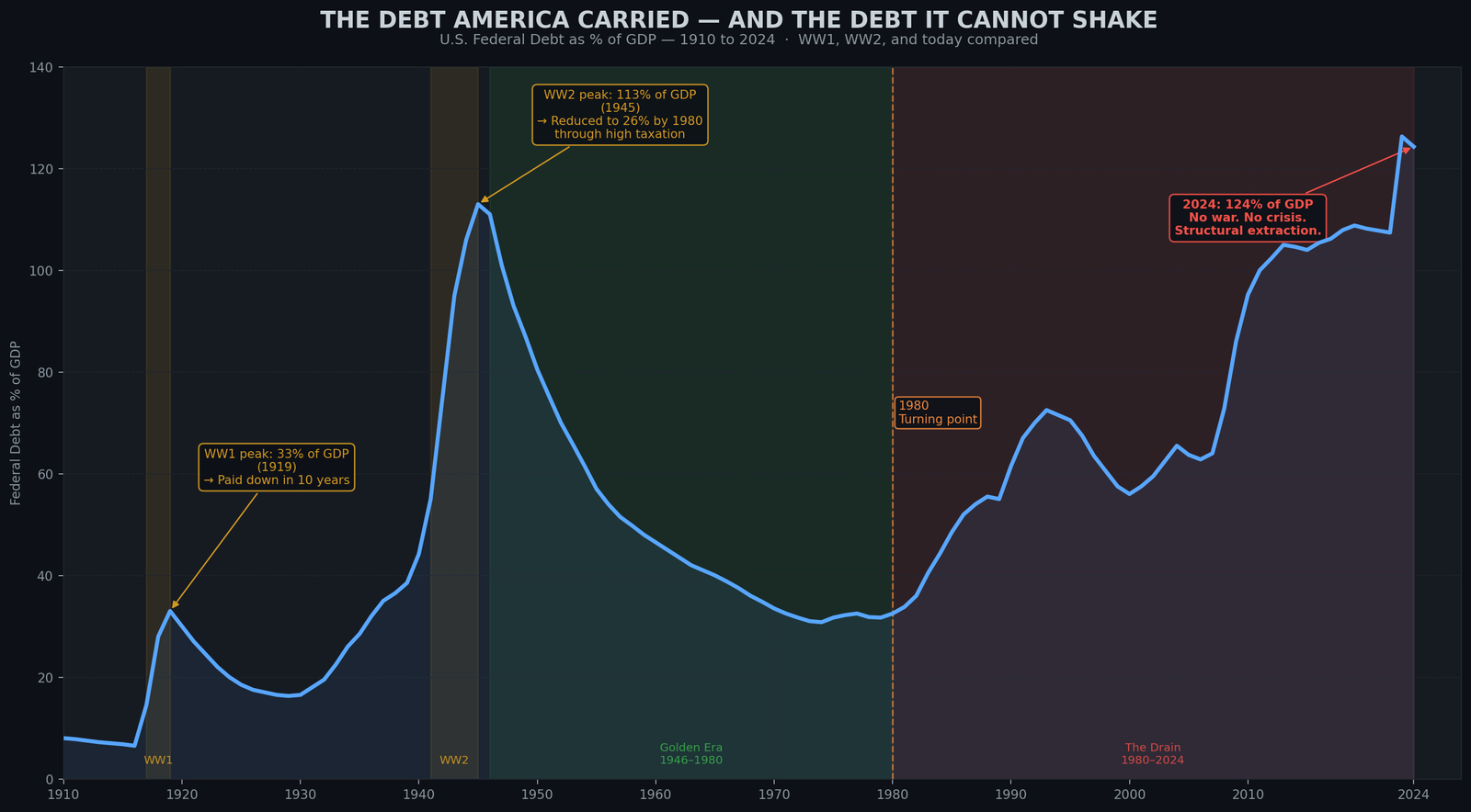
How to read Figure I.1: The blue line shows U.S. national debt as a percentage of GDP (the size of the economy) from 1910 to 2024. Two peaks stand out clearly: World War One (debt reached 33% of GDP by 1919) and World War Two (debt peaked at 113% of GDP in 1945). In both cases, the line came back down. The debt was paid off because taxes were kept high during the recovery years. The third rise, beginning in 1980 and still climbing today at 124%, has no war behind it. There was no external emergency. The debt grew because a structural drain was opened, and it has never been closed.
The dam translation: Every previous spike in the debt had an end date built in. The shooting stopped, the emergency taxes stayed, the drain was sealed. The pipe opened in 1980 has no end date. No war ends it. No treaty closes it. It widens by design.
What I Discovered
I took the lens I had spent two decades developing, the lens of flow systems, and turned it on the American economy.
The economy is a flow system. Money is the medium, but the rules are the same as a river. Inflow. Outflow. Structure. Pressure. Equilibrium.
Here is how it works.
Money flows in from four sources: taxes (especially from top earners), wages (payment for work), productivity (what factories and farms produce), and global trust in the dollar (the fact that other countries use American currency). That is the inflow.
Money flows out through four channels: public services (schools, roads, police), infrastructure (bridges, water systems, power grids), wages, and healthcare. That is the outflow.
For thirty-five years, from 1945 to 1980, the flow was balanced. Inflow roughly equaled outflow. The dam filled. Stability.
Then a structural drain opened.
Since 1980, a pipe has been widening at the top of the system. It drains wealth upward, out of the general flow.
The mechanisms are specific and measurable: tax cuts for the wealthy, stock buybacks (when corporations buy back their own stock instead of investing in workers), monopoly pricing, financial deregulation, offshore accounts (places outside the United States where the rich hide money to avoid taxes).
Every year, this pipe drains more wealth than the system puts back in.
The dam has responded by borrowing. Debt has become the borrowed water that fills the gap when outflow exceeds inflow. The debt is the symptom. The drain is the cause.
The public narrative misses this entirely. Politicians say: “Our debt is too high. We need to cut spending or raise taxes broadly.” But that addresses the symptom, not the disease.
It is like telling a homeowner whose roof is leaking: “Your water bill is too high. Take a shorter shower.” You are treating the wrong problem.
The dam translation: When the headlines say “the debt is the problem,” they are pointing at the bucket on the floor, not the hole in the ceiling. The debt is borrowed water filling a gap. The gap is what you are not allowed to see.
A Moment of Recognition
The moment of recognition came when I looked at the numbers from 1945 to 1980.
During that era, the top tax rate never fell below 70%. The federal government collected taxes from the wealthy aggressively. Corporations invested in their workers, not in buying back their own stock.
Public investment was sustained at a scale we no longer recognize: highways, schools, power grids all expanded. The national debt, as a percentage of the total economy, fell for thirty-five years in a row. (Source: OMB Historical Tables)
In that same period, the middle class exploded into existence. Median family income doubled in real terms (meaning adjusted for inflation). A single job could support a family. A summer job could pay for college. Homeownership reached 65%. (Source: U.S. Census Bureau, Historical Income Tables)
The top 1% captured about 11.8% of the national income in 1976. The lowest point in the century. (Source: Piketty & Saez, NBER)
Everything moved in the right direction together.
Then in 1980, it changed. The drain began to open.
Tax rates on the wealthy fell from 70% to 28% within eight years. Union rights eroded. Public investment slowed. Regulations on finance were dismantled.
Corporations stopped investing in workers and started buying back their own stock. The wealthy began moving money offshore.
The result was immediate and measurable.
The top 1% income share climbed back up. Today it is 21.8%. Almost exactly where it was in 1929, right before the Great Depression. (Source: Piketty & Saez, updated 2024)
The middle class began to stall. Wages flatlined. Student debt exploded. Healthcare debt became the leading cause of personal bankruptcy. (Source: American Journal of Public Health, 2019)
The national debt climbed from 26% of GDP in 1980 to 124% today. The borrowed water that fills the gap keeps rising.
The dam translation: From 1945 to 1980 the dam was sealed. The water rose for thirty-five years and the entire country drank from it. After 1980, the same plumbing was rewired to send the water upward. The pipes did not break. They were redirected.
This Is Not Left vs. Right
Before you dismiss this as partisan, understand: both parties sustained the drain.
Ronald Reagan cut the top tax rate from 70% to 28%. Bill Clinton signed the financial deregulation bill that helped cause the 2008 crash.
George W. Bush expanded the tax cuts and started two unfunded wars, ballooning the debt. Barack Obama did not reverse the financial deregulation. He bailed out the banks instead.
Donald Trump cut corporate taxes from 35% to 21% in 2017. (Source: Tax Policy Center, Historical Marginal Tax Rates)
The drain widened under both parties. Not at the same speed, not in the same language. But the trajectory is unambiguous.
The villain is not a politician. The villain is not even a party. The villain is the design itself. A structural error that was never corrected, and has been systematically deepened, because it benefits the people with the power to deepen it.
This is where the series begins.
The dam translation: Every president since 1980 has stood at the same control panel. Some pressed the pedal hard, some pressed it softly. None of them turned it off.
An Invitation
You might be angry after reading this. You might feel vindicated — proof that something is wrong, that your intuition was correct. You might feel despair, because if the drain has been widening for forty years, what can you possibly do?
All of those responses are human and valid. But this series is not designed to make you angry or hopeless. It is designed to give you something more valuable: a map.
The map shows you the territory. It shows you exactly how the drain works, which pipes are which, how they were built, and which ones could theoretically be sealed.
When a politician tells you “the economy is doing great,” you will be able to point to the exact pipe they are looking at. You will be able to see, with precision, which pipes they are ignoring.
When someone says “there is no such thing as trickle-down economics” or “we have to cut Social Security,” you will have the framework to understand what is actually being proposed and what the real effects will be.
You will have the map. That is the beginning of agency.
The next chapter is called “The Elite Cycle.” It is the emotional and historical hook of the series. You will see the pattern repeat across American history — extraction, crisis, protest, reform, inclusion, then reversal. The same six-stage cycle, over and over.
You will realize: we are here again. We have been here before. Exactly here.
And that recognition changes everything.
The Dam Series: The Hidden Drain Destroying the American Middle Class — All Chapters
Read the full series at rational-observer.com. New chapters publish weekly.
| Title | What it covers | Status | |
|---|---|---|---|
| Intro | You are here — Why The American Economy Feels Broken | The dam metaphor. The 1980 turning point. Why this is not partisan. | ✅ Published |
| Ch. 1 | Wealth Inequality in America: The Elite Cycle | The six-stage extraction cycle that has repeated three times in U.S. history — and which stage we are in now. | ✅ Published |
| Ch. 2 | How the U.S. Economy Really Works: The Dam Explained | The four components of the dam: inflow, outflow, the elite pipe, and debt. The WWII proof that debt is a symptom, not the disease. | ✅ Published |
| Ch. 3 | Why Americans Can’t Afford to Live Anymore | The scissors chart: wages +31%, costs of housing + healthcare + education +413% since 1970. The invisible depression. | 🔜 Coming Soon |
| Ch. 4 | Obama’s Economy: The Surface Patch | How 2008 was stabilized without structural repair — and how Trump then widened the drain deliberately. | 🔜 Coming Soon |
| Ch. 5 | The Illusion of Refill: Why Tariffs Cannot Fix the Dam | What tariffs actually are, what happened in April 2025, and why the bond market reversed policy in under 90 days. | 🔜 Coming Soon |
| Ch. 6 | Does Trickle-Down Economics Work? 45 Years of Data | Buybacks grew 157-fold. Wages grew 35%. The complete evidence on supply-side economics — who it worked for and who it didn’t. | 🔜 Coming Soon |
| Ch. 7 | Why Nations Fail: The U.S. Transition From Inclusive to Extractive | The 2024 Nobel Prize-winning framework applied to the United States — and what it reveals about the structural transition since 1980. | 🔜 Coming Soon |
| Ch. 8 | 2025 and 1929: When History Repeats Exactly | Tariffs, tax cuts at the top, and federal capacity cuts — the identical toolkit deployed in 1929 that caused the Great Depression. | 🔜 Coming Soon |
| Ch. 9 | Why the U.S. Dollar Is Losing Power | De-dollarization, Bretton Woods, the petrodollar, and what the April 2025 bond market crisis revealed about external inflow. | 🔜 Coming Soon |
| Ch. 10 | Trust, Once Spilled | The Marshall Plan, 80 years of institution-building, and what is being dismantled — faster than it can be rebuilt. | 🔜 Coming Soon |
| Ch. 11 | The Final Warning | A climate scientist’s verdict on a system approaching a tipping point — and the historical evidence that repair is still possible. | 🔜 Coming Soon |
Share this introduction if you know someone asking why everything feels broken despite the headlines saying otherwise. The map is the first step.
Sources & Further Reading
Federal Debt & Fiscal History:
Office of Management and Budget (OMB) — “Historical Tables” — Complete U.S. federal debt data, receipts, and outlays from 1940 onward, including debt as percentage of GDP.
https://www.whitehouse.gov/omb/information-resources/budget/historical-tables/
Federal Reserve Economic Data (FRED) — “Federal Debt: Total Public Debt as Percent of Gross Domestic Product” — Quarterly and annual data on gross federal debt relative to GDP from 1939 to present.
https://fred.stlouisfed.org/series/GFDEGDQ188S
Income Inequality & Top 1% Income Share:
Piketty, Thomas & Saez, Emmanuel — “Income Inequality in the United States, 1913–1998” (NBER Working Paper 8467) — Foundational analysis of long-run income inequality and top income shares based on tax return data, updated through 2024.
https://www.nber.org/papers/w8467
Piketty, Thomas & Saez, Emmanuel — “The Evolution of Top Incomes: A Historical and International Perspective” (NBER Working Paper 11955) — Establishes that top income shares since the 1970s have recovered to 1920s levels in English-speaking countries.
https://www.nber.org/papers/w11955
Saez, Emmanuel — “Striking it Richer: The Evolution of Top Incomes in the United States” — Updated annual estimates showing top 1% income share trends through 2022.
https://eml.berkeley.edu/~saez/saez-UStopincomes-2022.pdf
Median Family Income & Wages:
U.S. Census Bureau — “Historical Income Tables: Families” — Long-run data on real median family income, household earnings, and income distribution by race and ethnicity.
https://www.census.gov/data/tables/time-series/demo/income-poverty/historical-income-families.html
Federal Reserve Economic Data (FRED) — “Real Median Family Income in the United States” — Seasonally adjusted series tracking real median family income from 1947 onward.
https://fred.stlouisfed.org/series/MEFAINUSA672N
Tax Policy & Marginal Tax Rates:
Tax Policy Center (Urban Institute & Brookings Institution) — “Historical Highest Marginal Income Tax Rates” — Complete historical data on top federal income tax rates from 1913 to 2025, with interactive tables.
https://taxpolicycenter.org/statistics/historical-highest-marginal-income-tax-rates
Medical Bankruptcy:
Himmelstein, David U., Thorne, Deborah, Warren, Elizabeth & Woolhandler, Steffie — “Medical Bankruptcy: Still Common Despite the Affordable Care Act” (American Journal of Public Health, Vol. 109, Issue 3, 2019) — Survey-based research finding that 66.5% of bankruptcies in the U.S. are linked to illness or medical bills.
https://ajph.aphapublications.org/doi/10.2105/AJPH.2018.304901
The author behind Rational-Observer is a climate scientist and data analyst who studies flow systems — in water, atmosphere, and economics. He writes at rational-observer.com.